
You are currently browsing the category archive for the ‘Act 4 Controversial Art’ category.
")
The building I picked for this assignment is Habitat 67, or simply Habitat, in Montreal, Canada.
Habitat 67 was built as a pavillion for Expo 67, designed by an Israeli-Canadian architect Moshe Safdie. Its main motive are cubes; symbols of stability, wisdom, truth, moral perfection. This building is a modern monument; something of a statement and is also widely considered an architectural landmark.
At first glance, this building didn’t seem to be exceptional in any way. Despite being built in the sixties, it still comes off as modern – straight lines, geometry, all made out of concrete. I wanted to pick something different to write about, but then I looked back and decided for Habitat 67. I looked at pictures from different angles, and it caught my attention.
The first idea and goal for the building was to create a natural habitat in harmony with living space in the limited urban settings. While this is achieved, I simply don’t see how this building, aside from its size, is relevant in anything. For the lack of a better word, it’s ugly. Hundreds of beige-colored concrete cubes stacked on top of each other like children’s building blocks with no rhyme or reason that’s apparently considered top-notch architectural planning. It’s huge; I’ll give it that, but if I walked past it, I wouldn’t spare it a second glance. To me, the walkways look just randomly thrown in like torn-off pieces of breakfast bacon and look about just as symmetrical.
However, I can see how it would make architects – especially in ’67 – stare in awe; with 354 concrete blocks, it’s a miracle it could be planned and built without completely tumbling apart. Nowadays, I think Habitat 67 just looks ordinary. Concrete and glass are all over modern architecture; in fact, they seem to be the main materials of choice when building something ‘hip’.
All in all, I think that if somebody wants to recreate this ‘impressive piece of architecture’, all they need to do is walk to the nearest toyshop and buy the biggest box of building blocks they can find.
This artwork “Event Drawing” is made by American Paul Sietsema.
It is made in 2009 and was represented by Matthew Marks Gallery.
I don´t know what to say….. I mean I don’t think that this is art.
It is really hard to say what Sietsema is trying to signal to the people with this work.
There is so very little information about “Event Drawing” but I will try to share my opinion anyway.
This work shares opinions, some may think it is good piece of work but I laughed at it first time I saw it. I don’t think Sietsema worked hard at all to make this work. It is just black paint on newspaper!?
I really cant understand how is this art… maybe it is just me because I’m not any art expert but really newspapers and black paint. I thought my 4 year old cousin make works like this not adult professional artist :D. I usually don’t understand art and almost always critic it but I cant see ANYTHING good in this work. And that’s something because I think I have a wild imagination.
I think if you compare this to some great famous old works you will cry how much art has changed…. I mean this is one of the many stupid works nowadays. Modern art usually is crazy and doesn’t make sense.
How things are going with art I don’t think we are going to see any new legendary work like “Mona Lisa” or “The last judgment”.
This work makes me feel confused…. Don’t I really understand nothing about art or is this really very bad work?
Also I wonder why I’m not an artist, because it looks like easy 😀 Modern art just doesn’t make sense……
I’m sorry if I insulted someone who likes this work and modern art! I thinks Im not the only one who thinks like this.
Sources: http://www.artnet.com/
Cube houses (also known as kubuswoningen) are designed by architect Piet Blom. They’re a set of innovative houses in Rotterdam and Helmond in The Netherlands. Cube houses in Helmond were finished in 1877, total of 18. Rotterdam’s cube houses were built in 1984. The houses are representing trees and all of them together a forest, so it’s supposed to be like a village within a city. 
Houses are very terrible because of their impracticalness, there’re usually around 100 square meters of space but one-third of it can’t be used due to the 45-55 angel degree. Houses have three floors, first one is for living, the second one has bedrooms and bathroom and finally the top floor usually has a small garden. Houses look very ridiculous for their weird shape. I personally wouldn’t ever want to live in this kind of house; look at the windows, they’re facing downwards straight to the streets and by that giving the other people straight view of sight in your house! At the first look you can’t even be sure are the houses just a joke or real deal. However some people might find this exceptional look appealing.
I could never ever in my entire life recommend anyone to even take a peek into these houses. It should be illegal to construct these kind of houses. There’s no going around the fact that cube houses just awful. How are you even supposed to live in them, I mean even by looking at them my head gets all dizzy.
Source: http://en.wikipedia.org/wiki/Cube_house
(Or maybe this building.)
I find it really hard to even start writing about this horrible building. Like… I just… ugh. What? I mean, okay, eggs. Everybody likes food, but it doesn’t mean you have to build a house and put millions of eggs on it.

So, the Torre Galatea Figureas was inaugurated in 1974, and it works as a theatre and a museum. Basically, it was build because to honor an artist named Salvador Dalí.
Okay, Dalí’s works are, you know, surreal and stuff, but they still in some way make sense. But eggs? I mean eggs? I’m sorry but I just can’t get over the fact that people decide to honor the person who does this:

by building an ugly orange house with a few omelettes on it.
I wouldn’t be honoured.
I’m sorry but I wouldn’t.
And I just can’t write anything more because of eggs.
That’s a legit reason.
I mean eggs.
EGGS.
Why didn’t they do anything awesome, like a theather museum in a dew drop form? That would be awesome, I’m telling you.
But eggs.


This is a photograph that is currently on display in the Museum of Modern Art in New York. The artist, Deana Lawson wanted to capture and find something familiar through strangers. She also says she wanted to question concepts of beauty and to describe the black body.
Questioning today’s beauty standards is of course a great and important topic, but am I the only who thinks it’s also getting quite boring? Most so-called artists and people who want some kind of change to today’s society say the exact same things: media is portraying the wrong picture, everything is beautiful, etc. Different type of artists just express the same things in a different way. Some through photographing, some paint, some write… but it’s always the same story.
The point above is the main reason I find this photograph pretty useless. It’s not really ugly in a way we think about the word ugly. It just doesn’t blow your mind or get you think about the deeper meaning of the masterpiece, like art usually should.
I personally don’t like to criticize art that much since everyone looks at paintings and other pieces of art from a different aspect. People also judge things from their personal experience. But to this photograph I give no mercy – it really makes me angry when an artist seems to forget how to be creative.
Sources: moma.org

The Haines Shoe House is a shoe-shaped house in Pennsylvanian, (United states)
Shoe seller called Mahlon Haines built a shoe house in 1948 as a kind of advertisement. The living room is located in the toe, the kitchen is located in the heel, and two bedrooms are located in the ankle. The Shoe House was visited of the reality television series The Amazing Race. The current owners are Carleen and Ronald Farabaugh who bought the house in 2004. Then the house received renovation and new paint. I would recommend this building to everyone who like shoes! In my opinion the shoe is built very nicely even if it would be strange to live in a Shoe but hey, it might be also experience. These days the shoe house is open for public tours, visitors can stand on the observation platform.
http://www.flickr.com/photos/hb2/515608732/sizes/l/
When you take a look at this building you wouldn´t say that this is an office. This ´´basket´´ office stands in Newark Ohio and it costed 30 million dollars to build it! I can´t believe society made such a ridiculous investment! I mean a basket! The colour is not even nice. And who knows what kind of business men are working in there. You can´t take them or the building seriously at all. Imagine, two business men are discussing about there work: ´´Yeah I maybe not working in a fancy office with my personal assistant, but you work in a picnic trashcan´´. Really this happens when we live in a too prosperous world, or at least when some people are living too prosperous. Imagine what we could do with the 30 million. I really not recommend this to anyone to see it. I´ts not because it´s not worth to take a look at, but I am just against the energy waisted on this building.
This house is designed by Nikolai Petrovich Sutyagin and built by him and his family.
The building of this house started in 1992 and finished in 2008.
This house was built to break the world’s record of the tallest wooden house in the world.
On my opinion this is not a typical art building or work of art ,though it’s weird as the art normally is.
This weird house makes feel dark , old and deserted , for this reason I chose this picture. I think that a house has to be nice , colorful and “fresh” .
Maybe some people may like this house , if they like broken things , dark atmospheres and old-looking buildings.
I can compare this house only to the ghost house of Linnanmäki 😀 it’s as ugly as that one.
I would not recommend this house to anyone because it’s not so nice that it has to be visited. A house like this can’t be called a “monument”.
Shortly said, this house looks like a deserted and broken and poorly constructed “work of art”.
I could not find the picture of the house but you can watch it here : http://www.strangebuildings.com/wooden-gagster-house-archangelsk-russia/

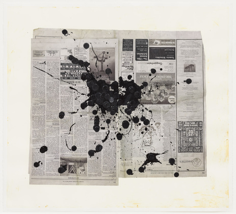
Philip Guston, 1954, oil on canvas
If walking inside an art exposition you would ever see this so-called painting you’ll probably ask yourself if that’s some kind of bad joke.
This painting realized by Philip Guston tries to follow the traces of the abstract expressionism but the result appears to be more like a canvas stained by colors than a piece of art. When Guston realized this painting he had just left the figuration with which he had work for more than a decade and it’s easy to see his inexperience in this attempt of art.
Although the artist tries to arouse some kind of feeling into the ones that look at his piece of work, he miserably fails since the only thing we see are layers of color superimposed on other layers of color.
There’s no need to go to an expensive art exposition to see something like this, it’s enough to delve in your three-year old son’s drawing and the effect will be exactly the same.
 First of all this enormous building that’s ruining the view is called The Ryugyong. It’s a hotel in North Korea. Even though it’s construction began in 1987 with planned completion in 1989, the building isn’t ready yet. The Ryugyong hotel is (unsuccessfully) designed by the Baikdoosan Architects & Engineers.
The architects of the Ryugyong hotel found the inspiration from the pyramids of Egypt but if the building is supposed to look like one, the architects failed, big time. Not only does the Ryugyong ruin the whole cityscape of Pyongyang, it also was voted as the ugliest building by the Esquire magazine.
What makes this building so hideous is actually almost everything. It doesn’t fit in the cityscape at all. The Ryugyong is way too big compared to the other buildings around it. I’m sure that it would look much better in Las Vegas next to all the other big weird buildings.
When I first saw this picture it made me speechless but now I just really want to know why hasn’t anyone decrypted this concrete monster yet?
Sources: Wikipedia.org, Photobucket.com
I personally don’t see anything good in this building. The reason why I choose this exceedingly ugly building was because there is so many adjective to describe the ugliness of this building. I mean look at this so-called House am pretty sure that ( Szancer) is also gone into shock when he have seen the Final Work of his project. Architecture is based on Jan Marcin Szancer (famous Polish artist and child books illustrator) and Per Dahlberg (Swedish painter living in Sopot) pictures and paintings. Construction of the building started in January 2003 and in December 2003 it was finished.
For me its hard to believe that someone can look at this building and not go off in a faint. I “blinded” just by watching some pictures of this so-called house. Am pretty sure that the designer of this building was involved with LSD ! I really can’t believe that some people go to Poland just because of this building!!! can you believe it ?? me neither =O If this would be in my housing development I would probably moved out of the city!
I warmly recommend to those kind of people to visit Poland to see that Crooked house who enjoy watching and experience extremely horrible things.


This weird house is designed by a FINNISH Matti Suuronen. The name is Futuro. Originally it was built for a ski cabin or holiday cottage. Actually one friend of Matti Suuronen wanted that Suuronen designed a ski cabin for him. Futuro’s weight is 4000 kilos, and eight people can be within at the same time.
In my opinion the house is really terrible!! It looks so small and so narrow. I don’t want never ever the house like Futuro is, even if it is just a cottage.. In some way Futuro can looks like funny or something, but I spite it! Maybe it is useful summer cottage, but how people can relax if you don’t have enough air to breath?!? Very distressing.. I don’t like anything about this house, I think that it is just a nice joke!
Very childish building, what a UFO!!
I was amazed when I noticed that this house was designed by Finnish guy! I didn’t know it at first. Btw you can see this ugly house alive in a Espoo’s Weegee museo, wow!

I selected this building, because it probably made the biggest impression. Believe me, this was a difficult choice, but I end up to this crazy building, which is actually a bank!
Nord LB building means Norddeutsche Landesbank. It was founded in July 1, 1970, and it’s still one of the largest banks in Germany. It is located in Hanover, nothern Germany.
I picked this one because I think that this building is a bit creepy. I mean, what makes it so horrible, is that it looks very dangerous! When I look at this photo, I see mostly walls and tunnels made of glass. And when I googled this building to see more photos of it, I saw that it’s not a low building (one source alleged that it’s 70 meters high). So, if you are even little scared of high places, I do not recommend this to you! Though, I bet that the engineer and the architect must have done a precise and professional job when this building has been designed…
However, I’m pretty sure that I wouldn’t enter this building voluntarily, and that’s why I choosed this one!
Pickle Barrel House

Firstly, this Pickle Barrel House was built in 1926 by William Donahey (an author, illustrator). The architectural part was done by Harold S. Cunliff. Mr. Donahey was also a cartoonist, he wanted to create a building representing his cartoon characters. He was the one who created the Teenie Weenies cartoon feature. This special cottage was built kind of for the Donaheys to use as a summer cabin in the woods at Grand Sable Lake to inspire their writings.
In my opinion, this building has nothing to do with art, that’s how I see it. I mean, have a look at it, does it look like art for you? To be honest, first I felt a bit angry when I saw this, my brains could not register that something like this has been allowed to be built. I know it sounds rude, but this building is really nauseating. It reminds me from some kind of trash bin or barrel-alike latrine.
How someone can call this building home, cottage or whatever? The color is really conspicuous, in a disgusting way of course. Waste and excrement, that’s what the color reminds me from. The shape is quirky. I have never seen such thing in my life before, this is the first time I’m really confused and astonished about a building’s architecture.
I personally don’t see anything good in this building. . However, people fan of cartoons might actually be exited to see something like this, especially little children. If I have to recommend visiting this building it would be intended for children.
Spur-of-the-moment; that’s what I call this building. Think twice before you get into action, that is all what I want to say for the person who ever built this wacky house. (in this case Mr. Donahey)
Comment briefly on one of these photographs by James Mollison. Choose a favorite and then answer the following questions in your comment + add a link to the photograph.
- What got your attention? Why do you like/dislike this particular room?
- What does the room say about our society?
- How would you compare this room to the room you sleep in?
